Commitments
The Commitments page helps you track your cloud commitments from both a coverage and usage perspective.
It is divided into three tabs: Overview, Logs, and Explorer. You can navigate between these tabs using the left sidebar.
Commitments Overview
Page description
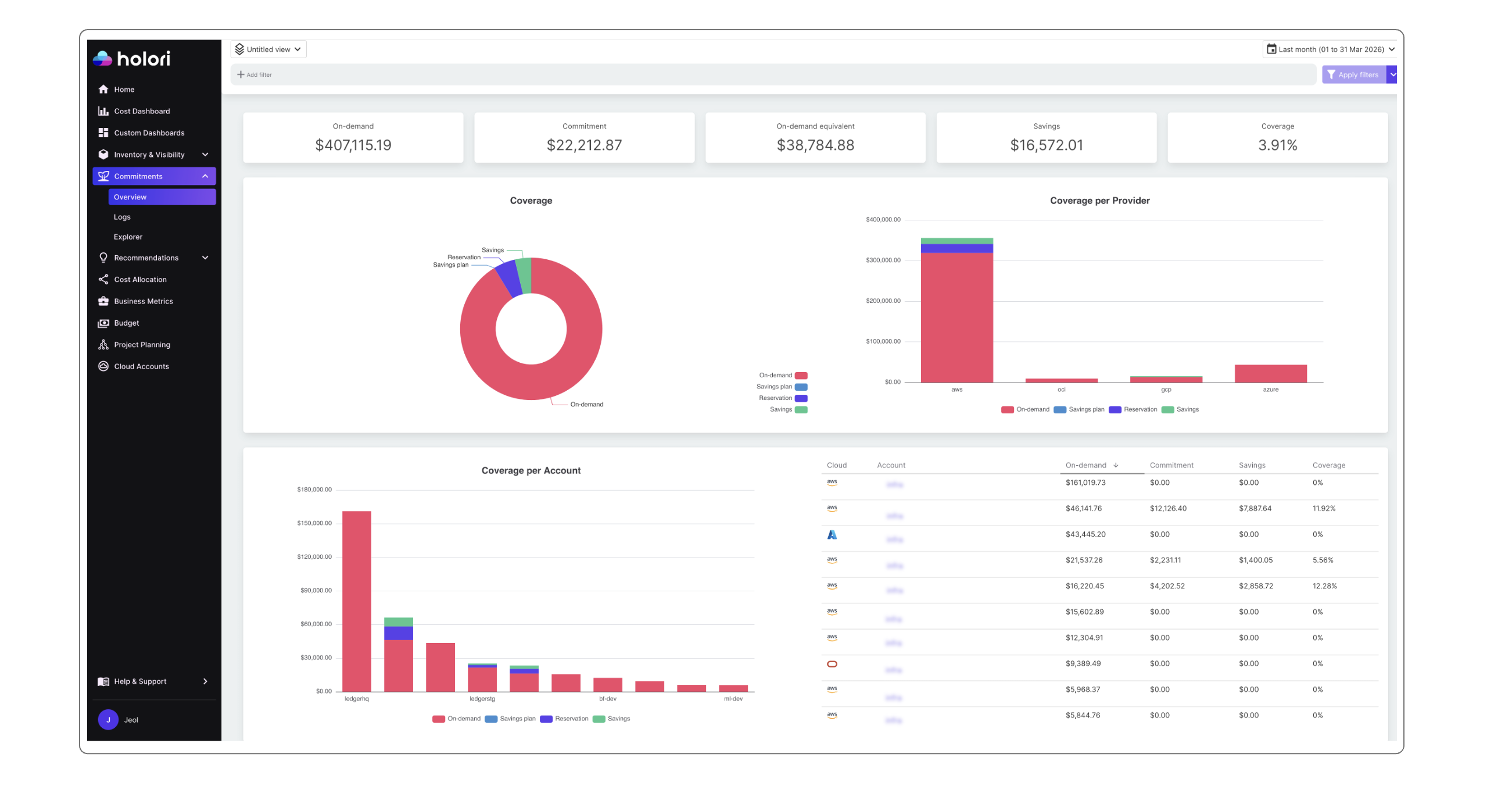
At the top of the page, you will find five key metrics:
- On-demand: what you currently pay for on-demand resources
- Commitments: the amount paid for commitments
- On-demand equivalent: what you would have paid using only on-demand resources
- Savings: the difference between on-demand cost and commitment cost
- Coverage: the percentage of your total cloud bill covered by commitments
Below, the first level displays two graphs:
- A global coverage view with a color breakdown: on-demand, Savings Plans, reservations, and savings (across all accounts by default)
- A provider-level view showing the same data split per cloud provider
The second level provides more detailed insights grouped by account:
- A graph showing the cost distribution across your main accounts
- A table listing your most expensive accounts
The third level focuses on services. A service refers to a product family such as AWS EC2 or GCP Compute Engine.
Filters and timeframe
At the top of the page, you can apply various filters. These are the same filters used across the Holori application.
You can also adjust the timeframe using the selector in the top-right corner.
Commitments Logs
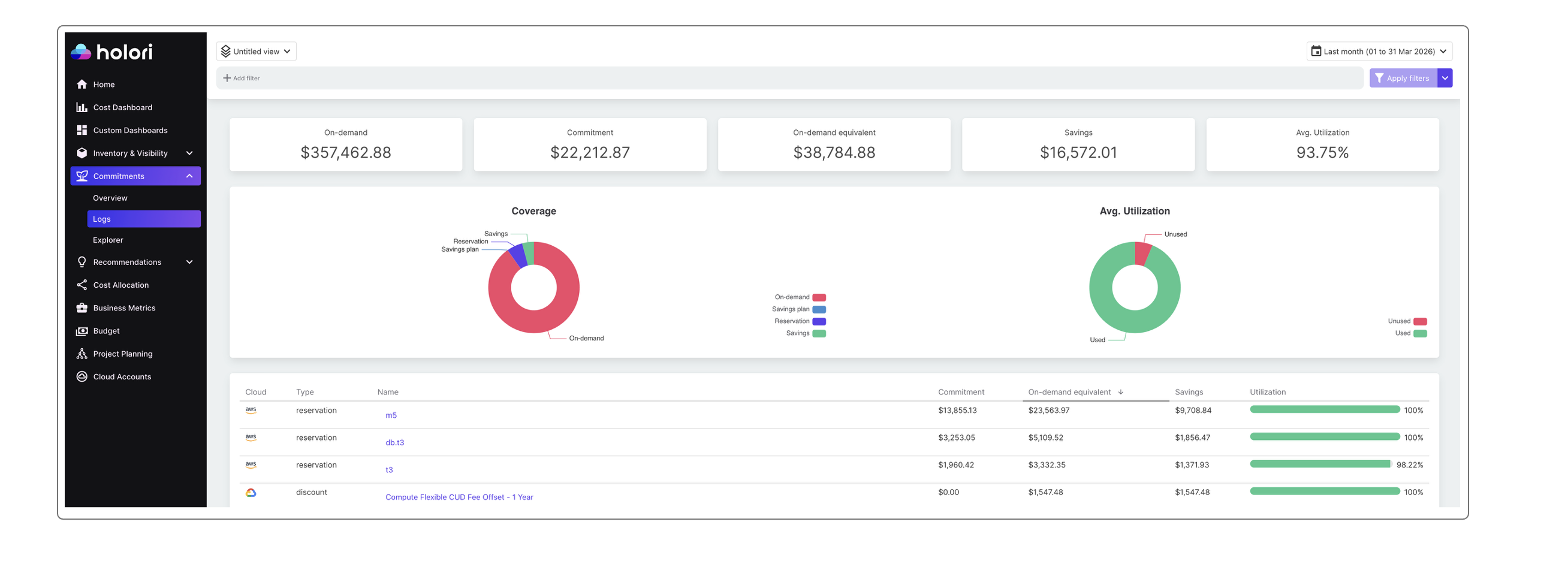
The Logs tab keeps the same top structure with five metrics. However, the right-most metric is replaced with Average utilization.
This value is also visualized in the graph on the right side of the screen, showing the split between used and unused commitments.
The table in the Logs tab includes:
- Commitment type and name
- Detailed commitment information (e.g. GCP CUD: Committed Usage Discount, such as "Compute Flexible CUD Free Offset - 1 year")
It also provides usage data for each commitment:
- Displayed as a percentage
- Visualized with a color-coded progress bar (red below 100%, green once fully utilized)
Explorer
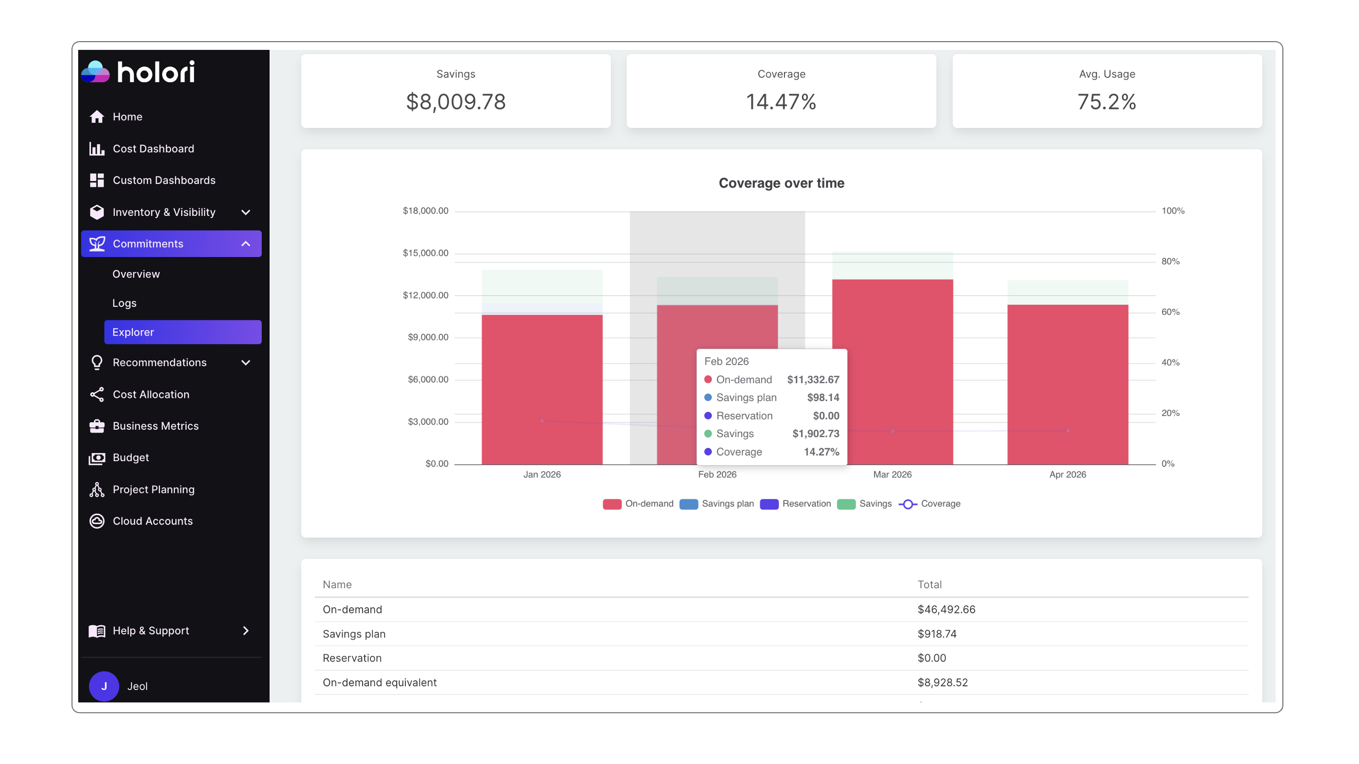
The Explorer tab allows you to track how your coverage evolves over time.
Use the timeframe selector in the top-right corner to adjust data granularity:
- Daily view for shorter periods (up to one month)
- Monthly view for longer timeframes
The graph displays:
- On-demand costs
- Savings Plans
- Reservations
- Savings
- Coverage (shown as a line across the selected period)
This makes it easy to visualize trends and monitor how your coverage changes over time.
Below the graph, a summary table includes:
- On-demand
- Savings Plans
- On-demand equivalent
- Savings
- Coverage
- Average usage
Each metric is presented with its corresponding value for the selected timeframe.